Understanding the Basics of Color Theory in Art Composition
What is Color Theory and Why It Matters in Art
Color theory is a framework that explains how colors interact and influence one another. Understanding this theory is crucial for artists as it helps them create visually appealing compositions. By grasping the basics of color relationships, artists can evoke emotions and set the mood in their work.
Color is the keyboard, the eyes are the harmonies, the soul is the piano with many strings.
At its core, color theory is about more than just mixing paints. It involves understanding the color wheel, which showcases primary, secondary, and tertiary colors. This wheel serves as a valuable tool for artists to navigate their color choices and combinations effectively.
Related Resource
Moreover, color theory allows artists to communicate ideas and feelings without words. For instance, warm colors can evoke energy and excitement, while cool colors often convey calm and tranquility. By mastering these concepts, artists can elevate their compositions and engage viewers on a deeper level.
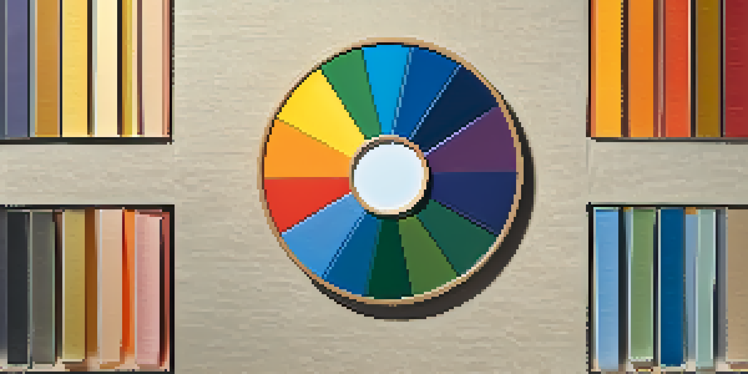
The Color Wheel: Understanding Primary, Secondary, and Tertiary Colors
The color wheel is the backbone of color theory, consisting of primary, secondary, and tertiary colors. Primary colors—red, blue, and yellow—are the building blocks of all other colors. When mixed together, primary colors create secondary colors, such as green, orange, and purple.

Tertiary colors are formed by mixing a primary color with a secondary color, resulting in hues like red-orange or blue-green. This blending creates a vast array of colors that artists can use to express ideas and emotions in their work. Understanding these relationships helps artists make informed choices about their palettes.
Understanding Color Theory Basics
Color theory provides artists with essential tools to create visually appealing compositions and evoke emotions.
By utilizing the color wheel, artists can create harmonious compositions that resonate with viewers. For example, complementary colors—those opposite each other on the wheel—can create striking contrasts, while analogous colors—those next to each other—offer a more subtle, unified look. Knowing how to navigate these relationships is key to effective art composition.
Warm and Cool Colors: Evoking Emotions in Art
Colors can be broadly categorized into warm and cool tones, each evoking different emotions and responses. Warm colors like reds, oranges, and yellows are often associated with energy, passion, and warmth. Artists frequently use these colors to create a sense of excitement or to draw attention to specific areas of a composition.
Colors are the smiles of nature.
In contrast, cool colors such as blues, greens, and purples tend to evoke feelings of calmness and tranquility. These colors can create a soothing atmosphere and are often used in landscapes or serene subjects. By understanding the emotional impact of these color categories, artists can better convey their intended message.
Related Resource
The interplay between warm and cool colors also plays a significant role in creating depth and contrast in art. For instance, an artist might use warm colors in the foreground to make a subject pop, while employing cool colors in the background to create a sense of distance. This strategic use of color enhances the overall composition and guides the viewer's eye.
Color Harmony: Achieving Balance in Your Art
Color harmony refers to the pleasing arrangement of colors in a composition. It aims to create a sense of balance and unity, ensuring that all colors work together cohesively. There are several approaches to achieving color harmony, including complementary, analogous, and triadic color schemes.
Complementary color schemes involve using colors that are opposite each other on the color wheel, such as blue and orange. This contrast can add vibrancy and energy to your artwork. On the other hand, analogous color schemes use colors that are next to each other, like blue, blue-green, and green, providing a more serene and cohesive look.
The Impact of Color Harmony
Achieving color harmony through various schemes enhances balance and unity in artwork.
Triadic color schemes consist of three colors that are evenly spaced around the color wheel, creating a dynamic yet balanced composition. By experimenting with these different color harmonies, artists can find the perfect combination that enhances their work and keeps the viewer engaged.
The Psychology of Color: How Colors Affect Perception
The psychology of color explores how different colors can influence perceptions and emotions. For instance, red is often associated with passion and urgency, making it a popular choice in advertising and design. Understanding this psychological aspect allows artists to choose colors that align with the message or feeling they want to convey.
Colors can also have cultural meanings that vary across societies. For example, while white symbolizes purity in many Western cultures, it may represent mourning in some Eastern cultures. By considering these nuances, artists can create work that resonates more deeply with their audience.
Related Resource
Incorporating this knowledge into art can elevate a piece from merely visually appealing to deeply impactful. Artists can intentionally select colors that evoke specific feelings, guiding the viewer’s emotional journey through their work. This understanding adds another layer of complexity to art composition.
Color Contrast: Creating Depth and Focus in Art
Color contrast is a powerful tool in art composition, helping to create depth and draw attention to specific elements. High contrast, such as pairing light and dark colors, can create a striking visual effect that captures the viewer's eye. This technique is often used to highlight focal points within a piece.
On the other hand, low contrast can create a more subtle and harmonious effect. By using similar shades and tones, artists can achieve a sense of tranquility and cohesion throughout their work. The balance between high and low contrast can significantly influence the overall mood of the artwork.
Using Color for Emotional Impact
Colors can influence perceptions and emotions, allowing artists to convey specific messages through their artwork.
Understanding how to manipulate color contrast enables artists to guide the viewer's experience. For example, an artist might use a vibrant color against a muted background to make a subject stand out. This strategic use of contrast not only enhances the composition but also communicates the artist's intent more effectively.
Practical Tips for Applying Color Theory in Your Art
Applying color theory in your art doesn’t have to be overwhelming. Start by experimenting with the color wheel and creating simple color palettes. Choose a limited number of colors from each category—warm, cool, complementary, and analogous—to see how they interact and complement each other.
Consider keeping a color journal where you document your color experiments. This practice can help you understand how different colors affect your compositions and allow you to reference successful combinations for future projects. Over time, you’ll develop a keen intuition for color choices.

Finally, don’t be afraid to make mistakes. Art is all about exploration, and understanding color theory will evolve as you practice. Embrace the learning process, and soon you'll find your own unique style that effectively incorporates these color principles into your work.