Exploring Color Harmonies: Techniques for Balanced Compositions

Understanding Color Theory: The Basics of Color Harmonies
Color theory is the foundation of creating harmonious compositions. It explores how colors interact and influence each other, providing a framework for artists and designers. Understanding the color wheel is crucial; it illustrates primary, secondary, and tertiary colors, helping you see how they relate.
Color is the keyboard, the eyes are the harmonies, the soul is the piano with many strings.
When you grasp the basics of color theory, you'll find it easier to select colors that complement one another. For instance, complementary colors, which are opposite each other on the wheel, create vibrant contrasts. This can add energy to your work, making it more engaging for viewers.
Related Resource
Moreover, analogous colors, which are next to each other on the wheel, can create a sense of calm and cohesion. This balance is essential for achieving the desired mood in your composition. By mastering these foundational concepts, you’re well on your way to exploring more complex color harmonies.
The Role of Warm and Cool Colors in Composition
Colors can be categorized into warm and cool tones, each evoking different emotions. Warm colors like reds, oranges, and yellows tend to create feelings of excitement and energy. Using these colors strategically can help draw attention to focal points in your work.
On the other hand, cool colors such as blues, greens, and purples often evoke tranquility and calmness. When balanced correctly, these colors can create a harmonious atmosphere. Imagine a serene landscape painting where cool blues dominate, inviting viewers to linger longer.
Mastering Color Theory Basics
Understanding the color wheel and color harmonies is essential for creating compositions that are visually appealing and emotionally resonant.
By understanding how warm and cool colors work together, you can create compositions that are not only visually appealing but also emotionally resonant. For instance, a sunset scene might use a warm palette to emphasize the fleeting beauty of the moment, while a morning scene might favor cooler tones to convey freshness.
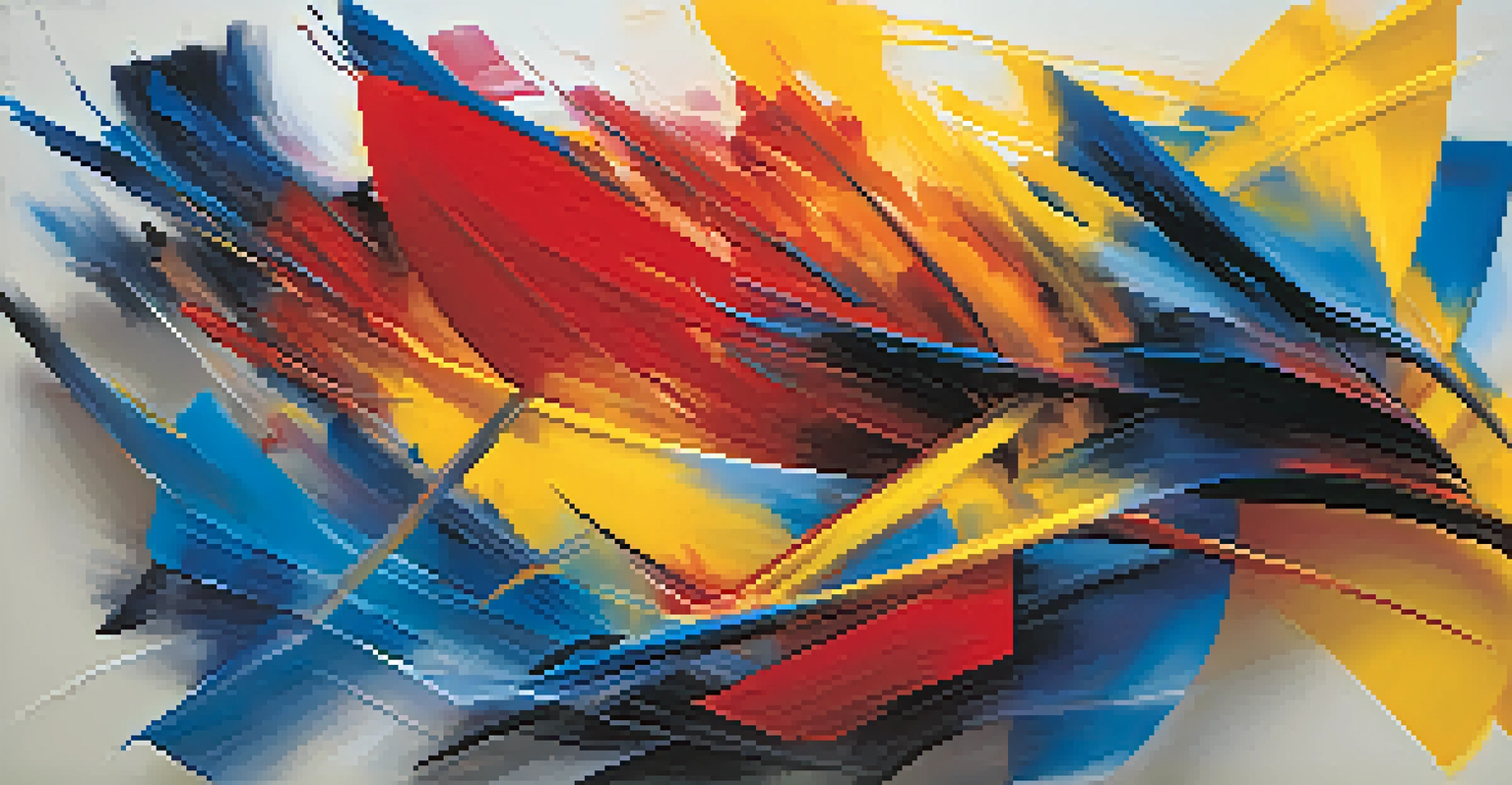
Exploring Triadic Color Schemes for Dynamic Designs
Triadic color schemes utilize three colors that are evenly spaced on the color wheel. This approach creates a vibrant and balanced composition, making your artwork pop. A classic example is the primary colors: red, blue, and yellow; when used together, they energize the viewer's experience.
Colors, like features, follow the changes of the emotions.
Using a triadic scheme allows for variation in color intensity and saturation, adding depth to your work. For example, you might choose to paint a landscape using a triadic scheme of blue, yellow, and red, where each color plays a unique role in the overall harmony. The key is to balance these colors to avoid overwhelming the viewer.
Related Resource
Additionally, experimenting with different shades and tints can help create a more cohesive look while maintaining the vibrancy of a triadic scheme. This versatility makes it a popular choice among artists and designers looking to inject personality into their compositions.
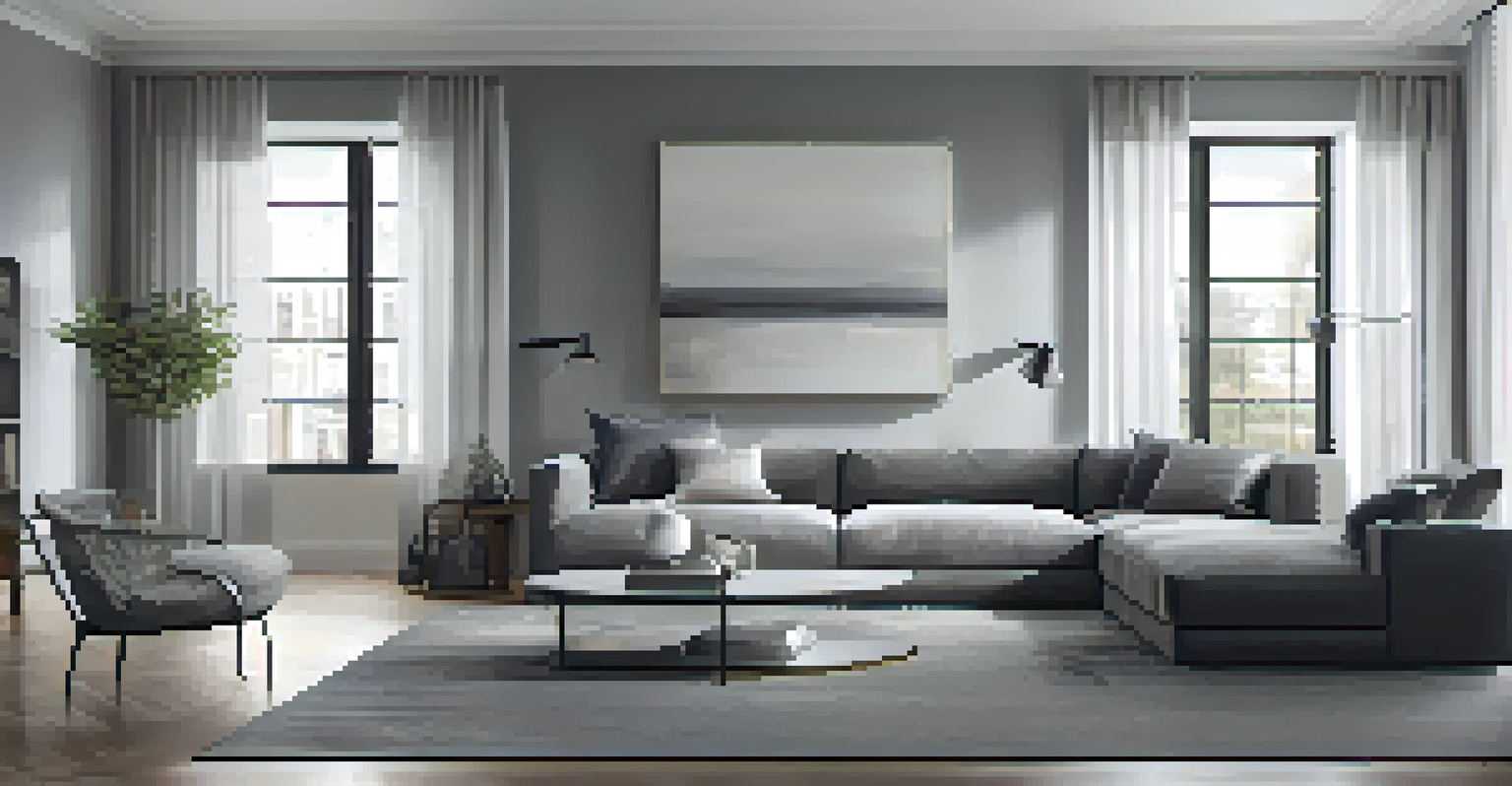
Creating Balance with Monochromatic Color Schemes
A monochromatic color scheme involves using variations in lightness and saturation of a single color. This technique can create a harmonious yet visually compelling design. For instance, a painting that utilizes various shades of blue can evoke a calm and serene atmosphere.
By adjusting the intensity of the chosen hue, you can create depth and interest without introducing additional colors. This is particularly effective in minimalist designs, where simplicity is key. Think of a room decorated in varying shades of gray; it can feel both sophisticated and cohesive.
Warm vs. Cool Colors
Using warm and cool colors strategically can evoke different emotions and enhance the overall mood of your designs.
However, to keep a monochromatic scheme engaging, consider adding contrasting textures or patterns. This strategy adds visual interest without straying from the color harmony. Ultimately, this approach showcases how a single color can express a wide range of emotions and ideas.
The Power of Complementary Colors in Design
Complementary colors are those that are opposite each other on the color wheel, and they can create striking contrasts. Using these colors in your compositions can enhance visual interest and draw attention to key elements. For example, placing orange next to blue can create a dynamic tension that captivates viewers.
However, it’s essential to use complementary colors judiciously. Overusing them can lead to a chaotic look, diminishing the impact of your work. Instead, consider using one color as the primary focus while the other serves as an accent, allowing the composition to breathe.
Related Resource
This technique is widely used in graphic design and branding, where creating a memorable visual identity is crucial. By leveraging complementary colors effectively, you can develop designs that stand out while maintaining a sense of balance and harmony.
Using Color Context to Influence Perception
The context in which colors are placed can dramatically influence how they are perceived. For instance, a vibrant red may appear more intense when paired with a neutral background, while the same color might seem subdued when surrounded by other warm tones. Understanding this dynamic is key to creating effective compositions.
Artists often use color context to convey specific messages or evoke particular emotions. For example, in advertising, a splash of bright color can attract attention, while a more muted palette might convey elegance. By thoughtfully considering the surrounding colors, you can shape how viewers interpret your work.
Experiment with Color Context
The placement of colors can influence perception, making it important to consider how surrounding colors affect the overall impact of your work.
Additionally, experimenting with color context allows for greater creativity. By playing with backgrounds and surrounding elements, you can discover unexpected combinations that enhance your overall design. This exploration can lead to innovative compositions that resonate deeply with your audience.
Practical Tips for Applying Color Harmonies in Your Work
When applying color harmonies in your work, it's helpful to start with a color palette. Tools like Adobe Color or Coolors can assist in generating harmonious color schemes based on your preferences. This initial step simplifies the process and gives you a clear direction.
Don’t be afraid to experiment! Create several drafts using different color harmonies to see what resonates best with your vision. Sometimes, the most captivating compositions arise from unexpected color pairings or schemes that you hadn’t initially considered.
Finally, always step back and evaluate your work as a whole. Assess whether the colors work in harmony to convey your intended message. Getting feedback from peers can also offer valuable insights and help refine your color choices.