Contrasting Colors: Creating Dynamic Visual Interest in Art
Understanding the Basics of Color Theory
Color theory is the foundation for artists, guiding them in choosing colors that evoke emotion and create balance. At its core, it explains how colors interact, and contrasting colors are vital for making elements pop within a piece of art. For example, pairing a bright yellow with a deep purple can create a striking visual effect that captures attention.
Color is the keyboard, the eyes are the harmonies, the soul is the piano with many strings.
Artists often refer to the color wheel, which organizes colors into primary, secondary, and tertiary categories. This tool helps visualize how colors can complement or contrast each other. Understanding warm and cool colors is also crucial; warm colors like red and orange tend to advance, while cool colors like blue and green recede, adding depth to artwork.
Related Resource
By grasping these principles, artists can begin to play with contrasts intentionally, creating compositions that not only draw the eye but also convey deeper meanings and emotions. This foundational knowledge sets the stage for exploring more advanced techniques in color application.
The Power of Contrast in Emotional Expression
Contrasting colors are not just about aesthetics; they also play a key role in emotional expression within art. Different colors can evoke various feelings, and when placed in contrast, they can amplify these emotions. For instance, a vibrant red against a soft blue can convey passion and serenity simultaneously, creating a dynamic dialogue between the colors.
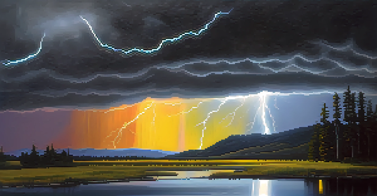
Artists can harness this emotional power by strategically placing contrasting colors to guide the viewer's feelings and reactions. Think of a stormy sky painted in dark grays and blacks juxtaposed with the bright yellow of a lightning bolt; this contrast not only captures attention but also invokes a sense of drama and urgency.
Color Theory Basics Explained
Understanding how colors interact through the color wheel and the concepts of warm and cool colors is essential for creating balanced artwork.
By understanding how colors interact emotionally, artists can create more compelling narratives within their work. This emotional resonance is what often makes art memorable, allowing it to linger in the viewer's mind long after they've walked away.
Creating Visual Depth with Color Contrast
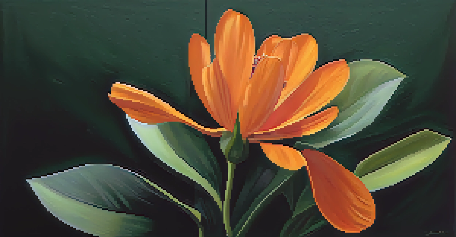
Using contrasting colors can also enhance the visual depth of a piece, making it feel more three-dimensional. When artists use lighter and darker shades of contrasting colors, they can create the illusion of space and form. For example, a bright orange flower against a dark green background can appear to pop off the canvas, adding layers to the composition.
Colors, like features, follow the changes of the emotions.
This technique is similar to how light and shadow work in photography; contrasting colors can emphasize highlights and shadows, drawing the viewer's eye to the focal points of the artwork. By mastering this technique, artists can transform flat, two-dimensional surfaces into rich, immersive experiences.
Related Resource
Ultimately, creating visual depth through contrasting colors invites the viewer to engage more deeply with the artwork, exploring its layers and discovering new details. This interaction enhances the overall appreciation of the piece.
The Role of Color Contrast in Composition
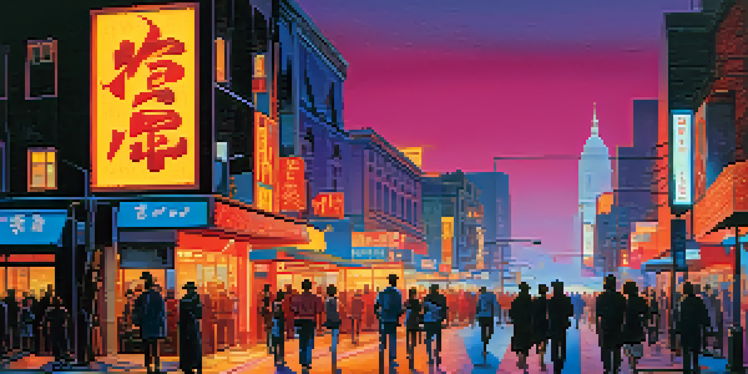
Composition is key in any artwork, and contrasting colors can significantly influence how a piece is structured. By placing contrasting colors in specific areas, artists can guide the viewer's gaze and establish a hierarchy of elements. For example, a bright red shape might be used to draw attention to a central figure, while softer colors recede into the background.
This strategic placement helps create a sense of balance and harmony within the artwork. Think of a busy cityscape where bright, contrasting colors highlight vital elements like billboards or traffic lights, allowing the viewer to navigate the scene effortlessly.
Contrast Enhances Emotional Impact
Using contrasting colors not only captures attention but also amplifies emotional expression, allowing artists to convey deeper narratives.
Effective use of color contrast in composition not only captures attention but also enhances storytelling within the piece, making it easier for the viewer to connect with the artist's message.
Historical Context of Color Contrast in Art
Throughout art history, contrasting colors have played a crucial role in various movements and styles. For instance, Impressionist artists like Claude Monet embraced contrasting colors to depict light and atmosphere in their landscapes. Their use of vibrant colors side by side created a shimmering effect that conveyed movement and emotion.
Similarly, the expressionist movement used bold contrasts to evoke strong feelings and emphasize the artist's emotional state. Artists like Edvard Munch, known for 'The Scream,' utilized color contrast to depict intense psychological themes, showcasing how colors can communicate complex emotions.
Related Resource
By studying historical examples, contemporary artists can gain insights into how color contrast has evolved and how they can incorporate these lessons into their own work. This connection to the past enriches modern artistic practices.
Practical Tips for Using Contrasting Colors
For those looking to experiment with contrasting colors in their artwork, there are several practical tips to keep in mind. First, start with a limited palette to avoid overwhelming the viewer. Choose a few contrasting colors that resonate with the emotion or message you want to convey, and build your composition around them.
Next, consider the balance between warm and cool colors. Using a combination can enhance contrast while maintaining visual harmony. For instance, a warm orange can be beautifully complemented by a cool teal, creating a captivating interplay that draws the eye.
Practical Tips for Artists
Artists can effectively use contrasting colors by starting with a limited palette, balancing warm and cool tones, and embracing experimentation.
Lastly, don't be afraid to experiment and trust your instincts. Sometimes the most striking contrasts come from unexpected combinations, so allow yourself the freedom to explore. This creative exploration can lead to unique and exciting results.
The Future of Color Contrast in Art
As we look to the future, the use of contrasting colors in art continues to evolve alongside technology and cultural shifts. Digital art, for instance, offers new possibilities for experimenting with color and contrast, allowing artists to manipulate hues and saturation with precision. This accessibility opens doors for more artists to explore the dynamics of color in their work.
Furthermore, the rise of social media platforms showcases art to a broader audience, creating a dialogue around color usage and trends. Artists are now inspired by global influences, leading to innovative approaches to color contrast that reflect diverse perspectives.
In this ever-changing landscape, one thing remains clear: the power of contrasting colors will continue to be a fundamental aspect of art, captivating audiences and enriching the artistic experience for generations to come.