The Role of Color Relationships in Creating Art Masterpieces

Understanding Color Theory: The Foundation of Art
Color theory is the backbone of how artists create visually compelling pieces. It encompasses the color wheel, which consists of primary, secondary, and tertiary colors. By understanding these relationships, artists can better manipulate colors to evoke emotions or convey messages in their work.
Color is the keyboard, the eyes are the harmonies, the soul is the piano with many strings.
For example, contrasting colors can create a sense of energy and excitement, while analogous colors often produce a calming effect. Artists like Vincent van Gogh used these principles to enhance the emotional depth of his paintings, such as in 'Starry Night.'
Related Resource
Ultimately, a solid grasp of color theory enables artists to make informed choices about their palettes, leading to more impactful and cohesive art pieces.
The Emotional Impact of Color Relationships
Colors are not just visual elements; they carry emotional weight and meaning. When artists pair colors thoughtfully, they can guide the viewer’s emotional response. For instance, warm colors like reds and yellows often evoke feelings of warmth and passion, while cool colors like blues and greens can inspire calmness and tranquility.
Consider the work of Claude Monet, whose use of soft blues and greens in 'Water Lilies' invites serenity. By understanding these emotional connections, artists can create pieces that resonate on a deeper level with their audience.
Color Theory Shapes Artistic Creation
Understanding color theory equips artists with the tools to evoke emotions and convey messages through their work.
This emotional aspect of color relationships is crucial in storytelling through art, as it helps establish mood and atmosphere.
Color Harmony: Balancing Visual Elements in Art
Color harmony refers to the pleasing arrangement of colors in a composition. Artists strive for harmony to create a unified look that feels intentional and aesthetically pleasing. Techniques such as complementary color schemes, where opposing colors are paired, can lead to striking and memorable artwork.
Colors, like features, follow the changes of the emotions.
For example, the bold use of red and green in Christmas-themed art captures attention while maintaining visual balance. Artists like Henri Matisse played with these ideas, often employing vibrant, harmonious color combinations in his work.
Related Resource
Achieving color harmony is essential in creating works that not only grab attention but also invite viewers to linger and appreciate the details.
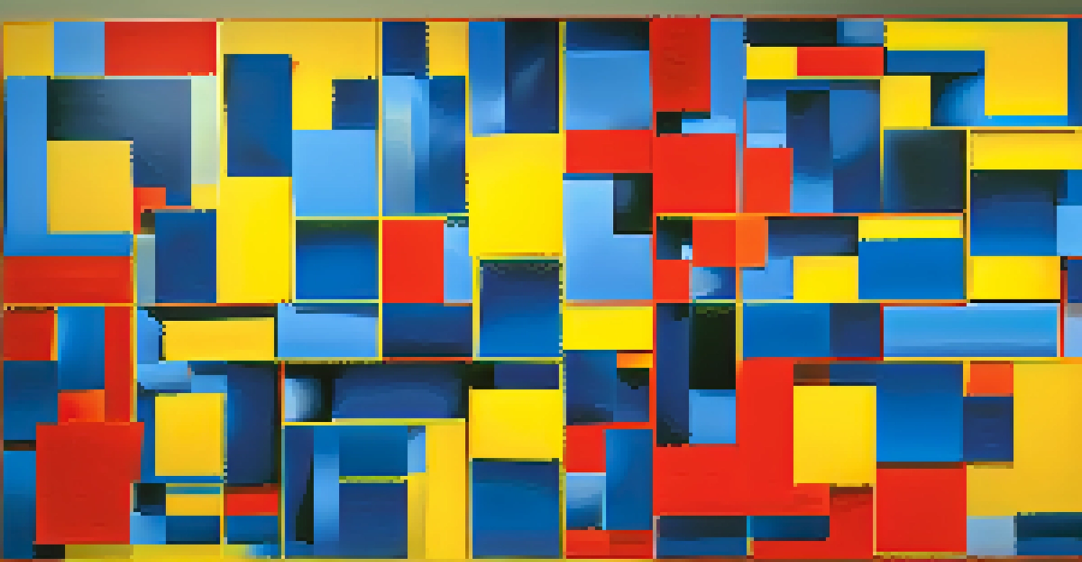
Contrast: Creating Depth and Focus in Art
Contrast is a powerful tool in art, particularly when it comes to color relationships. By juxtaposing light and dark colors or warm and cool tones, artists can create depth, highlight focal points, and guide the viewer’s eye. This technique can be seen in the works of artists like Caravaggio, who famously used chiaroscuro to enhance drama in his paintings.
The striking contrasts in Caravaggio's work draw attention to specific aspects of his subjects, making them leap off the canvas. This interplay of colors not only adds visual interest but also enhances the narrative within the artwork.
Emotional Weight of Color Choices
Thoughtful color relationships can guide viewers' emotional responses, enhancing the storytelling aspect of art.
Ultimately, contrast enriches the viewing experience, encouraging deeper engagement with the piece.
Cultural Significance of Colors in Art
Colors often carry cultural meanings that can influence how art is perceived. For instance, in many Western cultures, white symbolizes purity and innocence, while in some Eastern cultures, it can represent mourning. Artists who are mindful of these cultural associations can create works that resonate more profoundly with specific audiences.
Take the work of Frida Kahlo, who frequently utilized vibrant colors steeped in Mexican culture to express her identity and experiences. Her use of color was not just aesthetic; it was deeply tied to her heritage and personal narrative.
Related Resource
Understanding the cultural significance of colors allows artists to connect with viewers on a more meaningful level, making their work more impactful.
The Role of Color Relationships in Modern Art
Modern art has pushed the boundaries of traditional color relationships, experimenting with unexpected combinations and bold choices. Artists like Mark Rothko playfully explored the emotional resonance of colors in their purest forms, often using large blocks of color to evoke feelings without representational imagery.
This shift challenges viewers to engage with color on a visceral level, prompting personal interpretations and emotional responses. Such approaches have expanded the understanding of how color can function in art, moving beyond mere decoration to become a central element of expression.
Cultural Meanings Enhance Impact
Artists who consider the cultural significance of colors can create more resonant and meaningful connections with their audience.
In modern art, color relationships are no longer limited by traditional frameworks, allowing for greater creativity and innovation.
The Future of Color in Artistic Expression
As technology advances, artists are exploring new mediums and techniques that further redefine color use in art. Digital art, for instance, allows for an almost limitless palette and the ability to manipulate colors in ways not possible with traditional materials. This opens up exciting avenues for creativity and expression.
Artists can now experiment with color in real-time, adjusting hues and saturation to achieve their desired effects without the constraints of physical materials. This evolution encourages a fresh perspective on color relationships, as artists blend traditional techniques with modern technology.
The future of color in art promises to be vibrant and dynamic, continually challenging our perceptions and inviting new interpretations.