The Psychology of Color: How Colors Influence Mood in Art

Understanding Color Psychology in Art and Design
Color psychology is the study of how colors affect human behavior and emotions. Artists and designers often use this knowledge to evoke specific feelings within their audience. For instance, a bright yellow can stimulate happiness, while a deep blue might evoke calmness or sadness.
Colors, like features, follow the changes of the emotions.
By understanding the psychological impact of colors, creators can effectively communicate their intended message. This is crucial in art where the emotional response is often the primary goal. The choice of color can lead viewers to feel joy, anxiety, or tranquility—all through simple hues.
Related Resource
Ultimately, color is more than just a visual trait; it’s a powerful tool that shapes our experiences and perceptions. Whether it’s a painting that makes you feel nostalgic or a room that feels inviting, the influence of color is at play.
Warm Colors and Their Emotional Effects
Warm colors, like red, orange, and yellow, are often associated with energy, passion, and warmth. These colors can evoke feelings of excitement and enthusiasm, which is why they are frequently used in marketing and advertising. Imagine walking into a room painted in bright orange; it’s hard not to feel a surge of energy.

However, while warm colors can be stimulating, they can also lead to feelings of aggression or anxiety if overused. For instance, a restaurant might utilize red to stimulate appetite, but too much red could overwhelm diners. The key is balance, ensuring that the warmth of these colors enhances rather than detracts from the experience.
Colors Influence Emotions
Color psychology reveals how different hues can evoke specific feelings, impacting art and design significantly.
In art, warm colors can bring subjects to life, drawing viewers’ eyes and encouraging engagement. Artists often exploit this to create focal points within their pieces, ensuring certain elements stand out and resonate emotionally.
Cool Colors and Their Calming Influence
Cool colors such as blue, green, and purple are known for their calming and soothing effects. These hues can create a sense of tranquility and peace, making them popular choices for spaces meant for relaxation, like bedrooms or spas. For example, a soft blue wall can transform a room into a serene retreat.
Color is the keyboard, the eyes are the harmonies, the soul is the piano with many strings.
In art, cool colors often depict nature and water, reinforcing feelings of calmness. Think about a painting of a serene lake at sunset; the blues and greens create a peaceful ambiance that invites contemplation. This emotional response is a testament to the power of color choice.
Related Resource
While cool colors are generally calming, they can also evoke feelings of sadness or detachment if not balanced properly. Artists must carefully consider how these colors interact with one another to maintain the desired emotional effect.
The Symbolism of Colors in Different Cultures
Colors can hold different meanings across various cultures, significantly impacting how they are perceived in art. For instance, while white is associated with purity and innocence in Western cultures, it can symbolize mourning in some Eastern cultures. This cultural context is essential for artists to consider when creating works for diverse audiences.
Understanding these cultural nuances can enhance the emotional depth of an artwork. An artist might choose specific colors to resonate with particular cultural meanings, thereby enriching their narrative. This interplay of color and culture adds layers of meaning that invite viewers to engage more deeply.
Cultural Symbolism Matters
Colors hold varied meanings across cultures, making it essential for artists to consider these nuances in their work.
As global interconnectedness increases, artists often blend cultural symbols with personal expression, creating a vibrant tapestry of meaning. This fusion allows for a broader emotional impact, making art more relatable across different backgrounds.
The Role of Color in Brand Identity and Marketing
In the world of branding, color plays a crucial role in shaping perceptions and fostering connections. Companies often choose colors that align with their brand values, aiming to evoke specific emotions in their target audience. For instance, green is commonly associated with health and sustainability, making it a favorite for eco-friendly brands.
This strategic use of color can significantly influence consumer behavior. A well-designed logo that incorporates the right colors can create instant recognition and trust. Think of how you feel when you see the famous red and yellow of McDonald's; it evokes feelings of familiarity and comfort.
Related Resource
Ultimately, colors help to convey a brand's personality and mission, making them invaluable tools in marketing. By understanding the psychology behind color choices, businesses can craft messages that resonate more effectively with their audience.
Using Color to Enhance Emotional Response in Art
Artists often leverage color intentionally to evoke specific emotional responses from their viewers. By strategically combining colors, an artist can create a mood that resonates with the intended message of their artwork. For example, a piece filled with stark contrasts may evoke tension, while softer palettes might convey a sense of peace.
Color theory plays a significant role in this process, as artists study complementary and analogous colors to enhance their work's emotional impact. The relationships between colors can intensify feelings, guiding the viewer’s emotional journey through the art piece. This thoughtful manipulation of color can lead to a more profound connection between the art and its audience.
Color Shapes Brand Identity
In branding, color choice is crucial as it fosters emotional connections and aligns with a company's values.
Moreover, the emotional response to color can vary greatly from person to person, making art a deeply personal experience. An artist's choice of color invites individual interpretation, allowing viewers to connect with the work on their own terms.
Practical Tips for Using Color in Your Own Artwork
If you're an artist looking to harness the power of color, start by experimenting with different palettes. Consider the emotions you want to evoke and choose colors that align with those feelings. Creating mood boards can be a helpful way to visualize and refine your color choices before diving into a project.
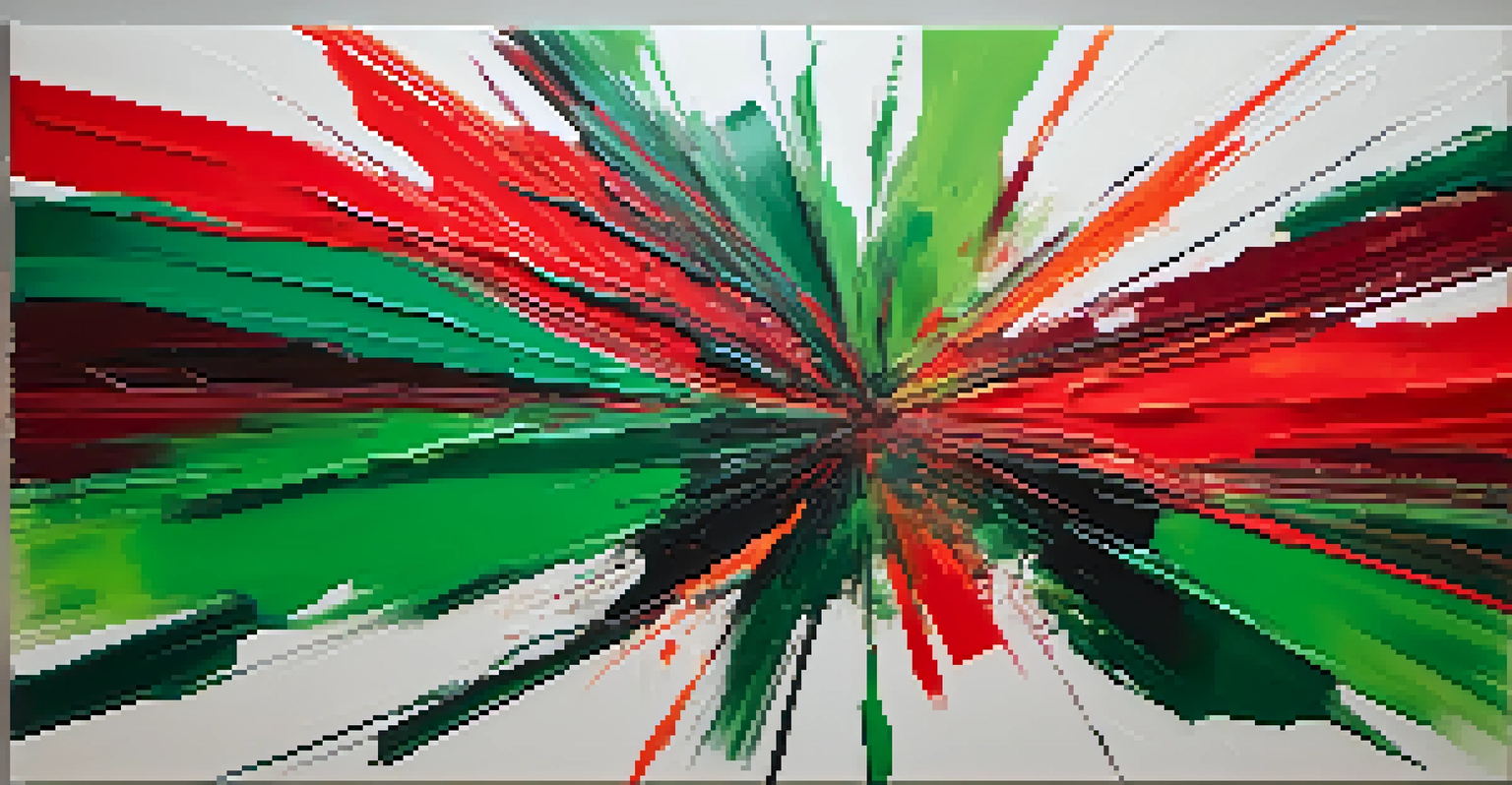
Don’t be afraid to use contrasting colors to create visual interest and emotional tension. For example, pairing a vibrant red with a deep green can create a dynamic composition that captures attention. This technique can be particularly effective in drawing the eye to focal points within your artwork.
Lastly, always consider the context in which your art will be viewed. The environment, lighting, and surrounding colors can all influence how your artwork is perceived. Being mindful of these factors will allow you to make more informed color choices that enhance the emotional impact of your work.